I’ve seen this article a few times now, but never felt the urge to comment on it until now. Perhaps it was because I just segued from the “Biggest Loser” article, or perhaps it was because I’m getting claustrophobic from not being plowed out yet. The big question we can ask ourselves is “what composition are we?”
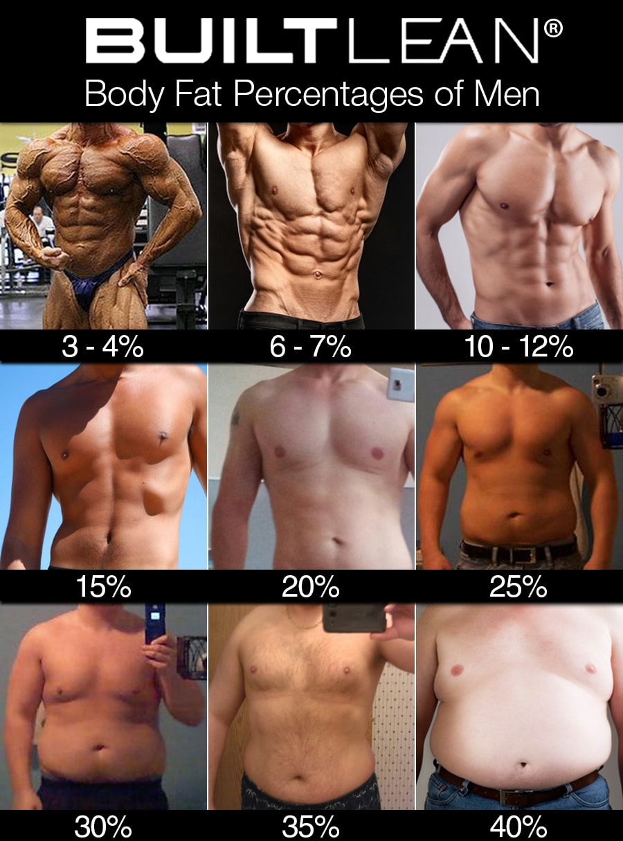
Some of us look in the mirror and see a person that is far thinner than they actually are. Others of us have the exact opposite reaction. I suppose there is a third group that just never looks in the mirror and does any sort of self-aware look at their body, but I think that probably places them more likely in the former group anyway. Having a good representation of body fats allows a person to see an unbiased, honest and external view of what your given composition actually is. The link on this BuiltLean.com website, does just that. Now, they are putting this up to sell some fitness routine products they are selling. I haven’t reviewed them, used them or know anything about them. They may be great or they may suck, I’m not commenting on or reviewing any of that. What I am doing is giving men and women a tool to visually see where they are.
The Body Mass Index (BMI) chart is hopelessly broken, but it is what is used for determining how healthy a person’s weight is. I think a far better model is percent body fat. There are healthy and unhealthy ranges for this, just like in BMI. Yes, there is variability from person to person, however the healthy range accommodates that. Sometimes however it’s hard to get a good handle on where we are with respect to that. I’m probably one of the few that gets calibrated skin fold measurements while also doing at-home skin fold measurements and having a scale that measures these things. If there was a good visual guide, it’d be possible to estimate which major range you are in and then come up with a reasonable estimate by looking in the mirror.
In the link you will see two “tables” of photos for each of the body types for both men and women:

Body Fat Percentages in men (H/T LeanGains.com)
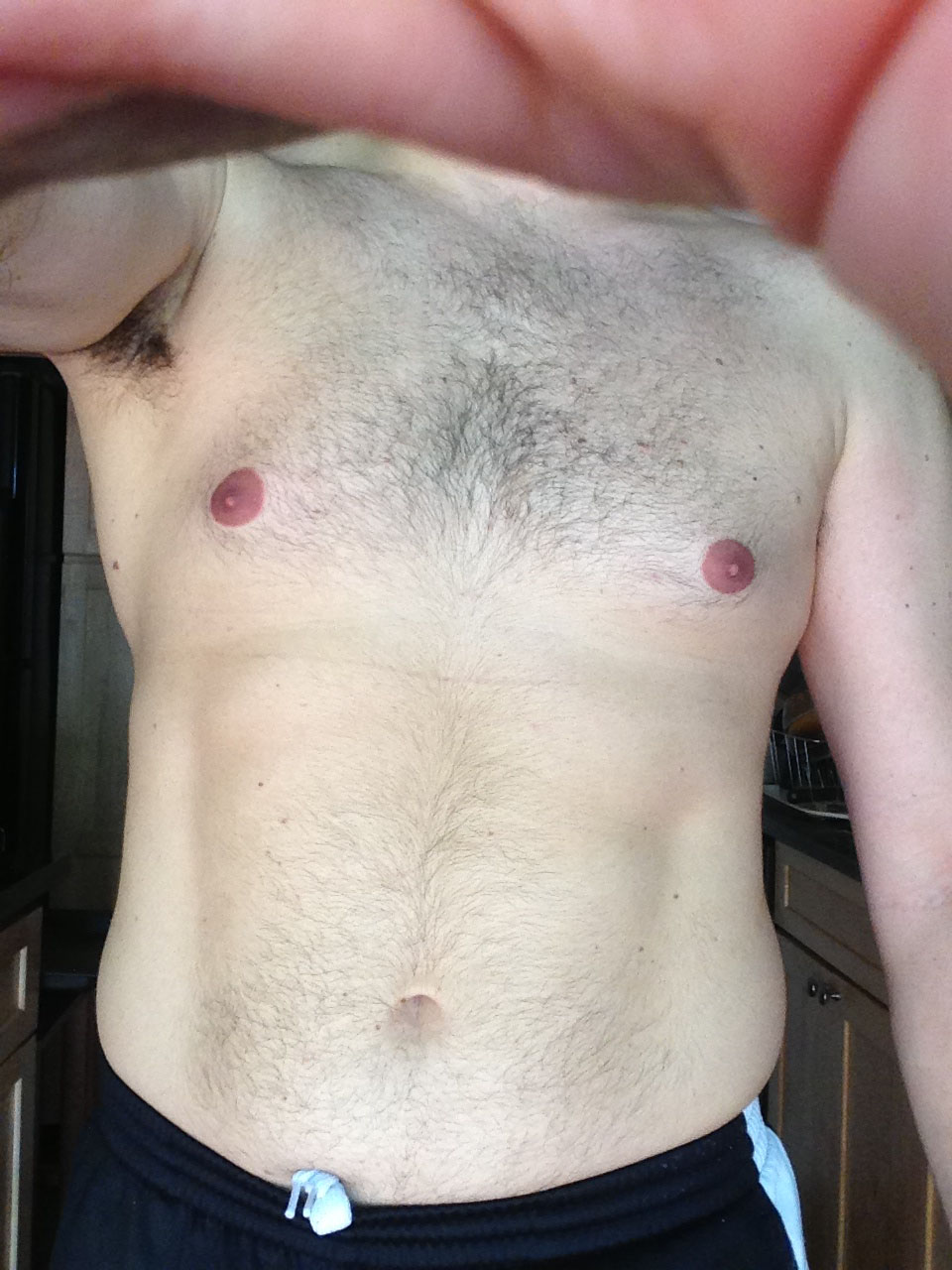
While there will be variation from person to person on fat distribution, from this you can get an idea of where you fall in the percentage body fat range. As a test case I used myself. Right now I’m between 16-17 percent body fat. If I look at the picture above I’d say I’m somewhere between 15 percent picture and the 20% picture. So, for me anyway, I think it works great. Despite my shyness in doing so, here is a picture of me from a couple months ago, in about the range I’m speaking of:

I’d say I look much closer to the 20% guy than the 15% guy, which would make sense since my body fat is closer to his range either. What do you think? If you happen to have a calibrated percent body fat measurement, how does yours compare to the table? Give it a shot, see where you fall in the list, and then cross check that with the healthy body fat range to see if you are doing great or should look into getting some improvement.


 2014-02-14
in

 3 min read